#Handmade


Uni Semester One Magazine Project.

Brief: to create a magazine using one of the chosen '#' themes (I chose #Handmade) that reflected the skills you've learnt. Put together on InDesign, using skills from Illustrator, Photoshop and gum printing.


0

Chocolate Orange


Towards the end of my first Uni semester, we had the opportunity to design our own Terry's Chocolate Orange packaging. I created an illustrated orange segment pattern for my design. Thanks to PCL Digital for printing the design. 


0

Uni Semester One

Project One: Typography from three given words; Panic, Mole, Purple

Project Two: Rebrand of Rubber Bands; new purpose Rubber Elastic Dog toy/ball

Project Three: 7hr Assessment, One Dish Restaurant logo - 'The Noodle Company'

Project Four: App for Generation Z, Changing room app that allows your friends to vote on whether   you should buy or not, useful for when shopping alone or on budget.

Project Five: Penguin Book Awards; Cover redesign for 'Animal Farm'

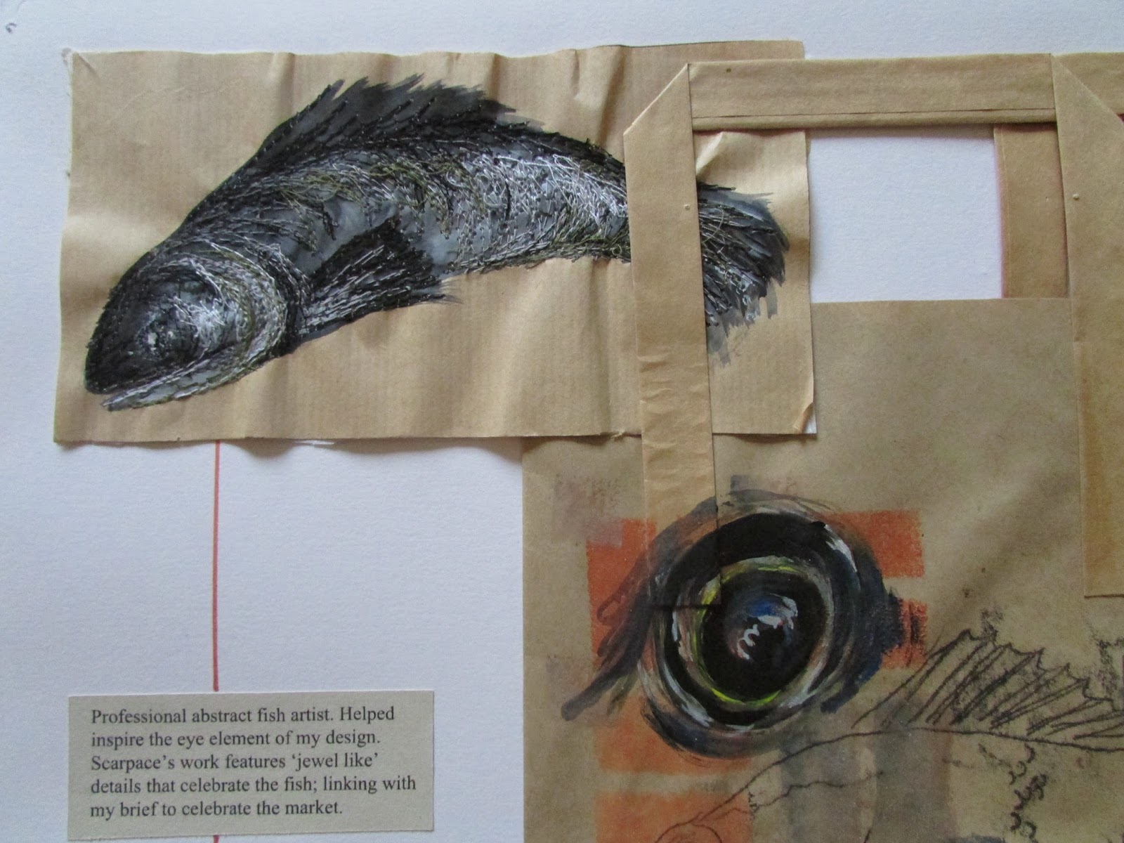
Project Six: 7hr Assessment, Redesign for a Business Card - Harbour Fish and Chips


0

Sugar it is!


A2 Graphics coursework project. 

The idea behind this was to 'Make a Difference' in terms of health advertising and the particularly current issue of sugar tax. Initial experiments began with research into the development, adaptation and the morals behind advertising through time - most of this research focuses on the tobacco and cigarette industry. This was accompanied with a visit to the Brand and Packaging museum, London. This concept of the development of health advertising was used in a accompanying essay 'A comparative study into past and present advertising'; where I compared these past examples with modern campaigns such as Change4Life.

With high focus on Sugar Tax and Jamie Oliver's recent work to get this recognised. I developed a campaign that highlighted some of the important facts about sugary/ fizzy drinks. This was styled in a very graphics and gruesome way. In this project the graphics were created from an initial series of photoshoots - which I also had a go at creating this graphic cut and skin irritation - then transferred into Adobe Illustrator, where I self taught myself this illustrative block shape way of developing a face or object. To add to the brand/ campaign identity, I used the hazard symbolism to develop a logo and focusing on Coca Cola, a individual hazard symbol for each type of Coca Cola. In addition, I designed a landing page for the campaign which outlined the key aims. 


0

Market


A2 Alevel Fine Art.

The concept for a brown paper market bags came from the overall theme of 'Environment'. Each bag was inspired by a different stall of a market. The handmade appearance of the bags reflects the atmosphere of a market. The overall purpose of the bags was the celebrate the traditions of a market, at a time where they aren't as important to the majority of society anymore.


0

Frustration


I linked this AS Graphic Design project to Parkinson's Awareness because of a close family connection to the disease. Through exploring and researching Parkinson's, including a questionnaire, my project aim was to educate in the form of a poster campaign. I wanted to allow people to understand what it's like to have Parkinson's through associating it with a difficulty that everyone might experience - reading a London Underground map. The tube lines also have a close link to brain function and neurons. I chose 'Frustration' because of a questionnaire response, but also because it is a less stereotypical aspect of the disease - most people just consider the hand shaking element.

As well as exploring the NHS advertising posters, I also linked the campaign to Parkinson's Awareness Week as the recognition of awareness was a key message I wanted to put across in my work. This project not only allowed me to create and design a piece of work, I also developed a deeper understanding into Parkinson's Disease myself.


0

Mist Perfume

Alevel Media Coursework.

A series of sophisticated perfume adverts. The styling reflects on vintage perfume campaigns, such as Chanel.


0

Transformation - Cadbury's


My AS Graphics exam title was Transformation and for the project I chose to re-design the packaging for Cadbury's. In doing this I selected colours, flavours and chose a design that was more suitable for an older demographic.

Applying my media studies knowledge and research into colour psychology, I began exploring the use of colour and its meaning - eventually I chose to use a more 'muted' purple shade, therefore still with close association to Cadbury's, the colours for each flavour also reflected that. I also researched current chocolate bar packaging, and ended up creating a wrap around packaging style with gold foil.


0